Industry · July 16, 2026
How to Read a Before-and-After Gallery
The before-and-after gallery is the single most persuasive page on any plastic surgeon's website, and it is also the least regulated. Lighting, posture, expression, and selection bias can manufacture a transformation that the scalpel never delivered, and every experienced surgeon knows exactly how. That does not make galleries useless. It makes them a document you have to know how to read. Here is what an honest gallery looks like, what a curated one is hiding, and the specific questions that separate the two.
By The Editorial Desk
6 min read
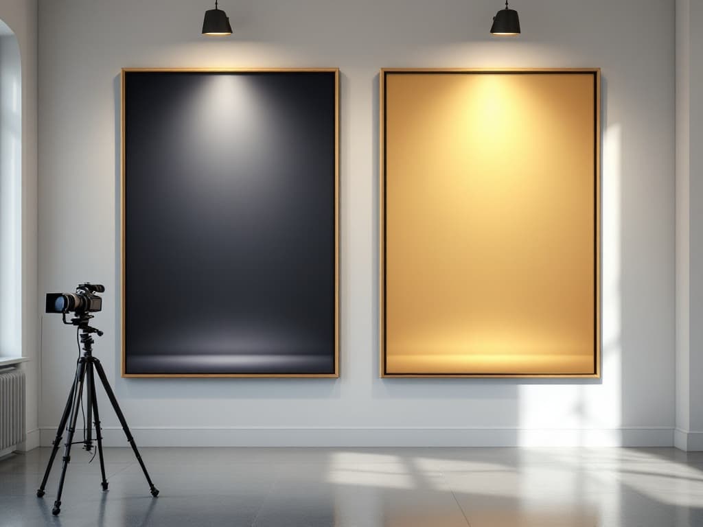
Learning how to read a before-and-after gallery is the closest thing to a required skill for anyone considering plastic surgery, because the gallery is where most patients actually make their decision. Credentials get checked, reviews get skimmed, but the photos are what convince. The problem is that clinical photography is a technical discipline with published standards, and consumer-facing galleries frequently ignore every one of them. The same face, photographed twice on the same afternoon with different lighting and a different lens distance, can appear to have had surgery. Which means a gallery is not raw evidence. It is an argument the practice is making, and like any argument, it can be made honestly or dishonestly. The difference is visible once you know where to look.
Lighting does more work than the surgeon
The short answer: inconsistent lighting between the before photo and the after photo is the single most common way a gallery flatters a result, and it is the first thing to check.
Shadows are volume. A face lit from directly overhead shows every hollow, every fold, every jowl, because hard downward light throws shadow into them. The same face lit with soft, diffuse, frontal light loses those shadows and with them apparent years. Professional clinical photography standards, the kind published in the facial plastic surgery literature and taught in AAFPRS-aligned fellowship programs, exist precisely to eliminate this variable: same light sources, same positions, same distance, same background, same camera settings for every photo in the series. When you look at a gallery, compare the shadows first. If the before photo has harsh overhead lighting, visible pores, and a gray clinical background, and the after photo is warm, diffuse, and softly lit, you are not looking at a surgical result. You are looking at a photography result with a surgical result somewhere inside it. An honest practice photographs both images in the same room, against the same backdrop, on the same equipment. Many practices with genuinely good outcomes do exactly this, and their galleries look less dramatic for it. That restraint is a signal, not a weakness.
Posture, expression, and the makeup problem
The short answer: a raised chin, a slight smile, and a layer of makeup in the after photo can each simulate part of what the surgery was supposed to do.
The classic tells are consistent enough that they are worth listing. In facelift and neck photos, watch the chin angle: tilting the head up a few degrees stretches the neck skin and erases the very laxity the procedure treats, so a before photo with a tucked chin next to an after photo with a lifted one is doing surgical work with the neck muscles. In rhinoplasty photos, the standard documentation set in the peer-reviewed literature is six views (frontal, both laterals, both obliques, and base), because a nose can look excellent from one angle and unchanged from another. A rhinoplasty gallery showing only left laterals has chosen those laterals for a reason. In body contouring, stance width, pelvic tilt, and whether the patient is wearing the same garments matter enormously. And across every category, makeup in the after photo but not the before is standard practice at some clinics and indefensible under any published photography standard, since concealer and contouring exist specifically to simulate the results of procedures. The ASPS Code of Ethics prohibits advertising that is false, fraudulent, deceptive, or misleading, and photographs altered or staged to exaggerate results fall squarely inside that language. The rule exists because the temptation is universal.
"A gallery is not evidence. It is an argument the practice is making. An honest one shows you the same patient under the same light from the same angles, and lets the work speak quietly.
"
Selection bias: the photos you are not shown
The short answer: every gallery is a curated sample of the practice's happiest outcomes, and the honest question is not whether curation happened but how much.
No surgeon posts their complications. That is expected, and within limits it is fair: galleries function as a portfolio, and portfolios show representative good work. The distortion begins with the size of the gap between the gallery and the caseload. A surgeon who performs several hundred procedures a year and displays fifteen results has shown you roughly the 97th percentile of their work, and you should assume your own result will land somewhere below it. This is where volume of examples becomes informative. A gallery with forty facelift patients of different ages, skin types, and starting anatomy tells you the surgeon produces consistent results across the range of real patients. A gallery with six young, thin, photogenic patients tells you the surgeon has six photographs. Diversity of starting points matters more than the drama of any single transformation, because the relevant question is never whether the surgeon once achieved an exceptional result. It is what the median result looks like on someone who resembles you. During a consultation you are entitled to ask exactly that: to see results on patients with your anatomy, your age, your skin quality, including a result the surgeon considers merely average.
The timestamp problem
The short answer: an after photo taken at six weeks is marketing, because most surgical results are still evolving for a year or longer.
Swelling flatters some procedures and hides the flaws of others. An early rhinoplasty result at two months can look smoother than the same nose at a year, once swelling recedes and reveals irregularities. An early facelift can look tighter than it will at twelve months, when tissues settle. Scars, as the scar literature makes clear, look their worst around month three and their final appearance emerges at 12 to 18 months. So the follow-up interval on the after photo is not a technicality. It is the difference between showing a result and showing a phase. The stronger practices date their photos or state the interval, and the published photography guidance in journals like Plastic and Reconstructive Surgery treats standardized follow-up intervals as part of honest documentation. A gallery full of undated afters, particularly ones with fresh, subtle pinkness along incision lines, is showing you week-six optimism. Ask when the photos were taken. If the practice does not know, that is itself an answer.
The honest summary
Before-and-after galleries are worth reading, but only with the understanding that you are reading advertising built from clinical material. The checklist is short. Same lighting, same background, same camera distance in both photos. Same posture, same expression, same chin angle, no makeup asymmetry. Multiple angles per patient, especially for rhinoplasty, where the standard is six views. Enough patients, across enough different starting anatomies, that you can find someone who resembles you. And a stated follow-up interval, ideally a year or more, because an undated after photo is a phase, not a result.
None of these checks require expertise. They require only the willingness to look at the photography before looking at the faces. The practices doing honest documentation are easy to identify once you know the signs, and their galleries tend to look modest, consistent, and slightly boring. That is what real results look like in aggregate. The gallery that stops your scroll with a cinematic transformation was designed to do exactly that, and the design deserves at least as much scrutiny as the surgery.
Related reading: Why 'Natural Results' Became the Dominant Marketing Language and Scar Care After Plastic Surgery: What the Evidence Actually Supports.